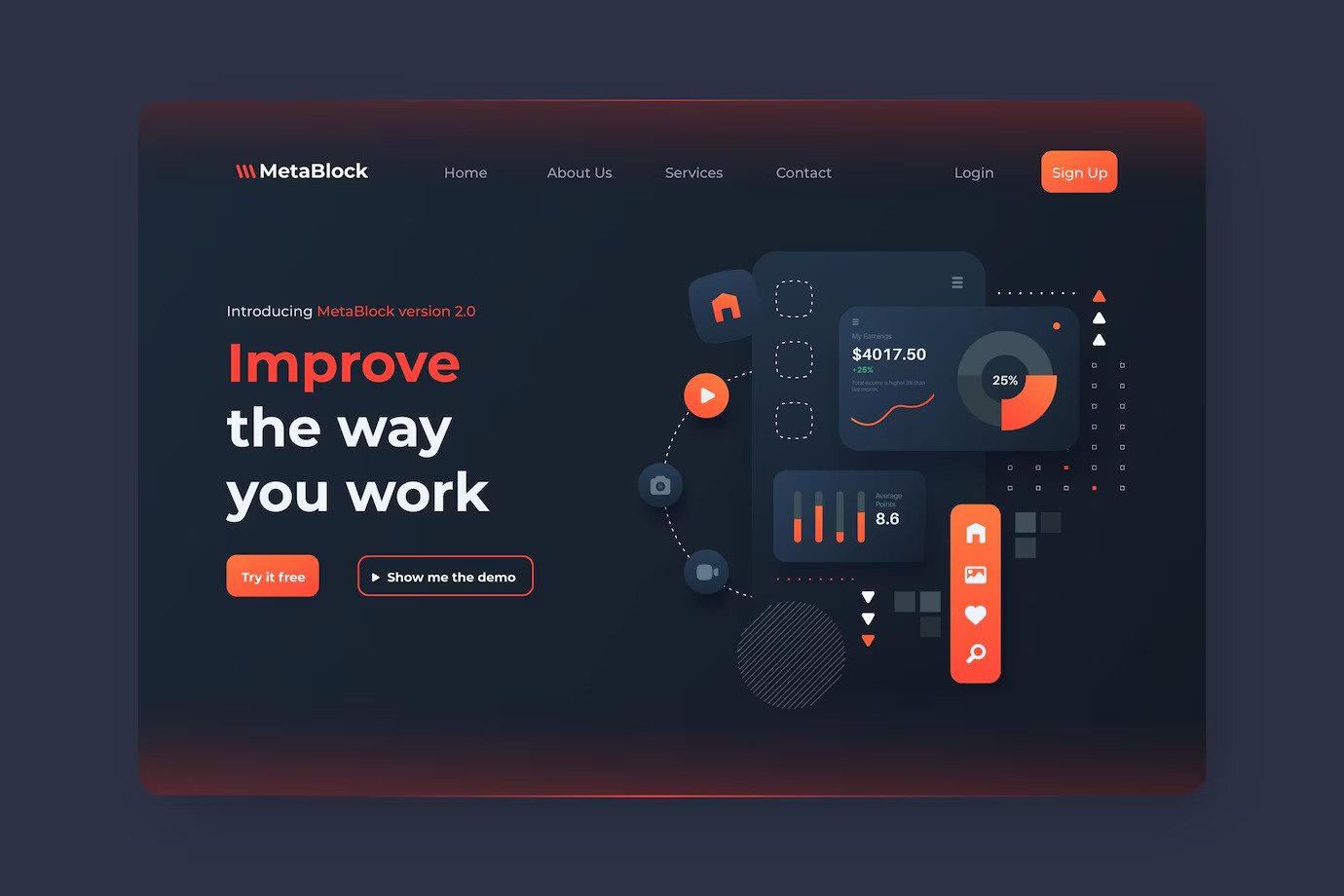
Web design continues to evolve each year, with new trends emerging to enhance user experience and capture audience attention.
In 2025, web design is set to break new ground, blending aesthetics and functionality in ways that were once hard to imagine. From innovative layouts to immersive experiences, web design has embraced technology and creativity like never before.
According to recent studies, 94% of first impressions are related to your site’s design, and it takes only about 50 milliseconds (0.05 seconds) for users to form an opinion about a website. This makes it crucial for businesses to stay updated on the latest trends to keep their visitors engaged.
So, what’s driving the web design landscape in 2024? Let’s dive into the top 10 trends.
1. Minimalistic Design
Less is more—but that doesn’t mean your website has to be boring. Minimalism remains a powerful trend in 2025, but with a twist. Web designers are focusing on clean, simple layouts while using bold typography, vibrant colors, and striking images to make an impact.
Minimalistic Design is the future of web design and it is going to dominate the web design trends in 2025. In simple terms, a design which incorporates very few elements to design an artistic and creative design. The clear focus is to simplify the content and graphics, so the less is more.
Minimalistic doesn’t always mean simplistic design, it also promotes the removal of unnecessary elements from the design.
How to design minimalistic:
1. Decide what you want to show the users, based on that limit your resources and focus on consistent design.
2. List down all the important elements for your website but make sure to remove unnecessary elements.
3. Limit the number of colors and fonts, finally combine all the elements.
2. 3D Design
3D elements aren’t just for gaming anymore. In 2025, web designers are incorporating three-dimensional graphics and animations into websites to create immersive experiences. This trend offers users a more engaging, interactive journey through a site. It’s not about showing off the latest technology—it’s about making websites feel dynamic, alive, and unique.

But how do users feel about it? The rise of 3D visuals can make or break a site’s usability. Overly complex designs may slow down page loading times, frustrating users. However, when done right, 3D elements can captivate and create memorable impressions.
Think of car websites where users can rotate a 3D model of a vehicle. It’s almost like having the car in front of you, ready for inspection. Nike has also experimented with 3D shoe models, allowing users to view the product from every angle.
3. AI-Driven Personalization
Artificial intelligence (AI) is no longer just a futuristic concept—it’s now an integral part of web design. In 2025, websites are increasingly utilizing AI to offer personalized experiences. This means the content, layout, and even design elements change based on the visitor’s behavior, preferences, or location.
For instance, if a user has previously interacted with certain products, the website might show them related items or tailor its interface to suit their tastes. This makes the experience feel more relevant and engaging. Think of AI as your invisible assistant, working behind the scenes to enhance user satisfaction.
E-commerce websites, in particular, benefit from AI personalization. Brands like Amazon and Netflix have already mastered this art, presenting users with curated content, products, and recommendations.
4. Oversized Elements and Bold Typography
There is a new trend of putting bold typography and oversized lettering on the website. Oversized Elements can easily draw the user's attention and engages them. The bold and big characters can reflect yours's brand message more effectively than smaller characters.
As we say, “the first impression is the last impression”, so your website first impression should be intuitive, engaging and attractive. You can also use a video or image as a background and overlay it with large typography. But you the content should be short and crisp, so that bold and big characters can easily fit on the page layout.
Read About: Why ADA Compliance Matters in App Development?
5. Negative / White Space
The blank areas between the elements on the website are called negative or white space. The white space creates a contrast and gives perfect balance. White space doesn’t mean that color of blank space should be white, you can choose any light color that contrasts with your main theme.
White space helps the user to focus on the main content on the website and gives a neat and clean appearance. The fundamental part of minimalistic design is to effectively utilize white space on the website. Whitespace gives the website a simple, uncluttered and balanced look.
6. Motion Design and Micro-Interactions
Micro-interactions are those small, subtle animations that occur when users engage with a website. Whether it’s a button that changes color when hovered over or a loading animation that entertains users while they wait, these small touches can make a big difference in user engagement.
Motion design, on the other hand, refers to the use of larger animations, such as scrolling effects, to guide users through a website. In 2025, both trends are being used more frequently to make websites feel interactive and alive.
Example:
When you “like” a post on Instagram, that little heart animation is a micro-interaction. Or, when scrolling through an article, and images slowly reveal themselves as you move down the page—that’s motion design at work.
7. Asymmetrical Layouts
Gone are the days of perfectly aligned, grid-based web designs. Asymmetry is taking center stage in 2025, allowing designers to break free from traditional layouts. By intentionally placing elements off-balance, websites feel more dynamic, creative, and unique.
But there’s a fine line between creative and chaotic. Asymmetry must be handled with care to ensure that the website remains navigable and user-friendly.
Example:
Fashion websites, like Gucci, often play with asymmetry to create a more avant-garde look. It keeps users interested and conveys a sense of uniqueness and modernity.
8. Simplicity
Simplicity in web design means removal of all unnecessary elements, clean layout, two- or three-color schemes, negative space and uncluttered elements. Simplicity is the new way of web design.
Simplicity can affect your design in three ways –
1. It improves the overall layout and design by making everything neat and tidy. This allows the users to easily scan and navigate through the website.
2. Simple designs load faster; this can also improve customer satisfaction and improve your website rankings on search engines.
3. It is quicker to design, manage and edit simple designs.
9. Augmented Reality (AR) Integration
Augmented reality has officially entered the world of web design in 2025. AR allows users to interact with real-world environments enhanced by digital elements. This trend is particularly popular in e-commerce, where users can “try on” products or visualize how furniture might look in their home without leaving the website.
AR brings a level of interactivity that helps users make better-informed decisions, which is a game-changer for online shopping.
Example:
Brands like IKEA have been early adopters of AR, allowing customers to see how furniture would fit into their space using their mobile devices. Expect more brands to embrace this trend as AR technology improves.
10. Voice Interface
11. AI-Generated Imagery
Example:
Imagine an e-commerce website selling handmade jewelry. Instead of relying solely on product photography, designers can use AI to generate unique lifestyle visuals showcasing the jewelry in different settings—such as a beach backdrop or an elegant evening event—without the need for expensive photo shoots. This approach allows for rapid content creation and customization to match seasonal trends or marketing campaigns.
12. Dark Mode Evolution

Why It Matters:
For instance, a finance app with a well-designed dark mode can reduce eye strain during late-night use while maintaining clear data visualization through carefully chosen accent colors. By prioritizing adaptability and user preferences, businesses can enhance engagement and usability.
FAQs
Staying updated helps businesses provide a fresh, engaging experience for users, which can lead to better retention rates and improved conversions. It also ensures that websites stay competitive in a fast-evolving digital landscape.
2. How do I decide which trends to implement?
Focus on your audience and their preferences. Trends should enhance user experience and align with your brand’s values and goals. It’s also essential to balance aesthetics with functionality.
3. Can following too many trends harm my website?
Yes. Overloading a website with trends can confuse users and make navigation difficult. Choose trends that serve a purpose and enhance the user experience, rather than following trends for the sake of it.

.png)

.webp?lang=en-US&ext=.webp)

.webp?lang=en-US&ext=.webp)

